
Most finance apps focus entirely on numbers and spreadsheets. SimplyBudget takes a different approach.
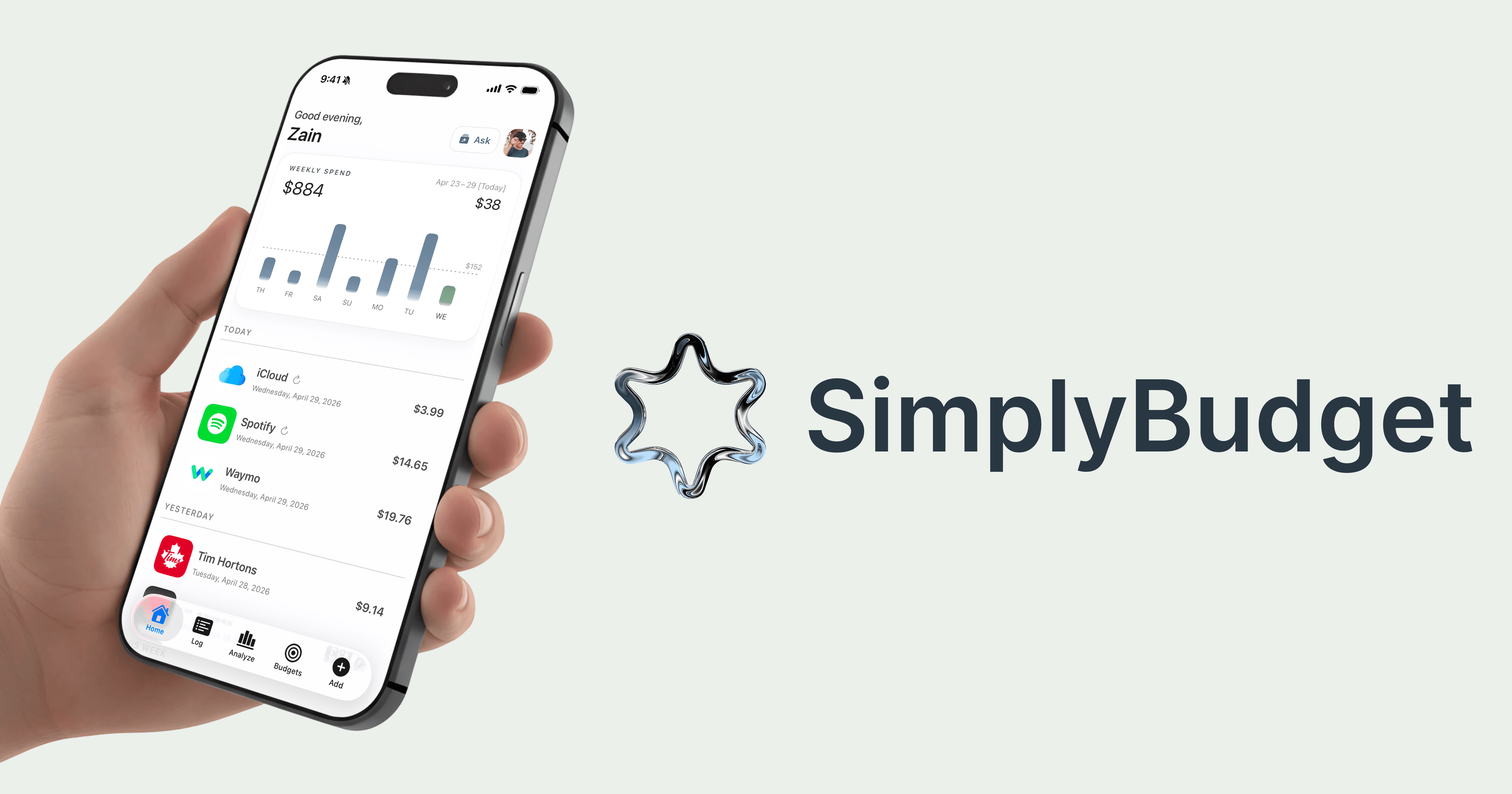
One of the core ideas behind SimplyBudget is making transactions easier to recognize instantly. Instead of forcing users to scan through large blocks of text, the app automatically attaches recognizable logos to supported merchants whenever possible.
This creates a more visual and intuitive experience that feels significantly easier to use on a daily basis.
Seeing a familiar logo helps users quickly recognize where they spent money without needing to carefully read every transaction. Combined with AI-powered categorization and cleaner layouts, this reduces friction and makes tracking spending feel more approachable.
The goal was never to make finance overly flashy. The goal was to make it feel understandable.
Many budgeting apps are designed like accounting software, often overwhelming users with complicated interfaces and unnecessary information. SimplyBudget was created to move away from that experience entirely and instead focus on simplicity, speed, and clarity.
This philosophy became even more important during the redesign of SimplyBudget 7.4. Every part of the app was rebuilt to feel lighter, cleaner, and more intentional. The migration from BrandFetch to Logo.dev also allowed for a more scalable and reliable transaction branding system moving forward.
SimplyBudget believes personal finance should not feel intimidating. It should feel visual, modern, and easy enough for anyone to start using consistently.